Which graph do you think best describes the chances of parties in the fight for Brighton Pavilion constituency? The most recent election, poll or perhaps the last general election in the constituency? In their attempts to woo voters both Labour’s Nancy Platts and Conservative Charlotte Vere are making some interesting choices with their graphs.
Why do election graphs even matter? Because our perverse electoral system means you just need a majority of one vote to win the seat. Many people don’t want to see their votes get wasted by voting for third or fourth parties who don’t have a chance of winning. So we have tactical voting – people voting for the least worst winnable option in their opinion. As a result all the parties vie to show how good their chances of winning really are.
Personally I think you’re only as good as your last electoral test. Yes different voting systems and types of election will influence how people vote – for example, UKIP do vastly better in Euro than local elections. However, for the same place, each election does build a picture of the relative strengths of local parties.
So let’s look at the tale of Brighton & Hove Green Party’s support in the Brighton Pavilion constituency. In 2005, when all the parties had different leaders (Blair, Howard, Kennedy and Greens yet to elect their first leader) and Brighton Pavilion had a different boundary, Keith Taylor brought home a record 22% of the vote for the Greens.
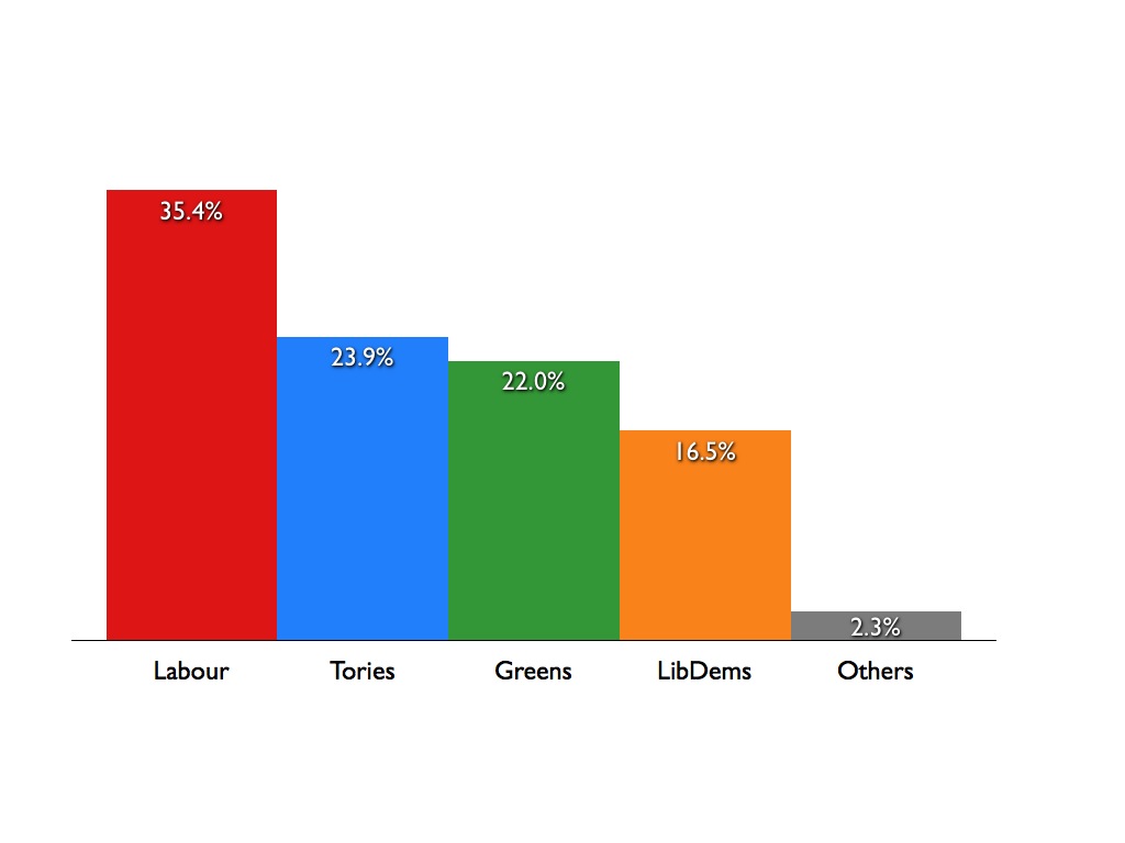
The May 2007 council elections saw us just beat the Tories into first place across the constituency. The December 2007 by-election in Regency ward (which elected me to the council) saw the gap between Greens and other parties widen dramatically. This was repeated in the 2009 Goldsmid by-election, but as it falls outside of Brighton Pavilion is not included here.


Next we saw the June 2009 European Elections. Unfortunately we don’t have constituency-level results for these but city-wide Greens came top, beating all the parties for the first time, a feat we repeated in several other cities across the country.

Finally in December 2009 the Green Party commission an ICM poll which showed the same pattern once again – Greens in the lead followed by Tories then Labour.
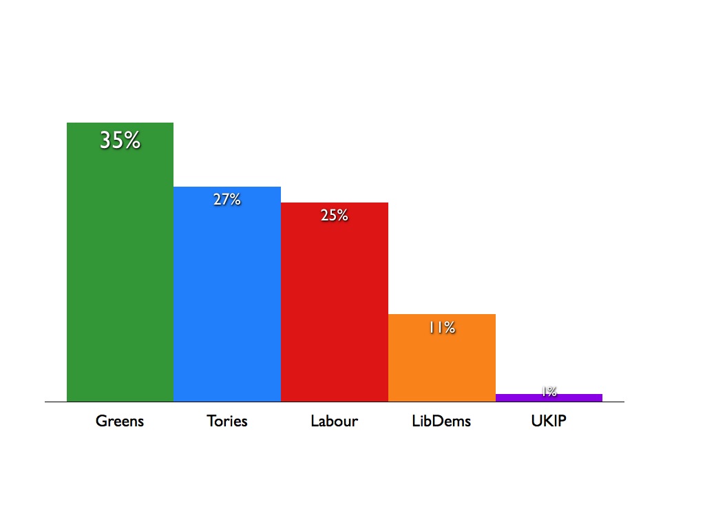
Some have criticised the poll result – yes it was commissioned by the Green Party – but ICM are a member of the British Polling Council and so are bound by its standards. It’s not like they bucked the trend – the graphs above show results have been pointing in this direction for quite some time. Furthermore the new boundary for Brighton Pavilion includes all of Hanover & Elm Grove ward, which is represented by three Green councillors and has had a strong Green vote for a very long time indeed.
All this to say that the electoral statistics are not easy to address for Caroline Lucas‘ opponents. Still it’s interesting to observe how they handle the challenge. Labour’s Nancy Platts goes for ignoring 5 years of history and suggesting that a Green vote will let the Tories in.


This is Nancy’s only option, the most recent graph which shows Labour ahead in the constituency. Sadly, if anything, thanks to our electoral system a Labour vote is likely to let the Tories in this time around. Labour have been trying the old ‘Green vote lets the Tories in’ trick for years in Brighton & Hove, I think people are pretty sick of being told something which evidently hasn’t been held out in recent elections.
(On a side note in writing this post I’ve noticed that different online sources cite the 2005 Green result as either 21.9% or 22.0% — it’s not just a rounding issue, the actual voter numbers differ e.g. BBC vs UK Polling Report. Not a massive difference but just wanted to flag up that I’m aware of it.)
Charlotte Vere treads a rather unusual path with her graphs. First this gem from her most recent leaflet:

My scanner may not be the best in the world, but the graph really is that jagged and blocky on the leaflet itself! Notice anything missing from the graph? Yes – Green and LibDem votes! In my view, it really is an extraordinarily misleading graph.
The same leaflet also includes a graph showing remarkable levels of support for the Conservatives:

Pulse, a news rag for GPs, conducted a poll of some of their readers. I’m told by GP friends that the paper is heavily funded by pharmaceutical companies and isn’t considered much of a serious news-source. Regardless, given that most GPs are well into the top tax bracket it’s no surprise they support Tories. But unless there has been a rush of GPs moving to live into Brighton Pavilion, this poll is unrepresentative and bears no relation to what’s happening in the constituency. Is it there for any reason other than to mislead?
While we continue to suffer under our simplistic, winner-takes-all electoral system I’m afraid these kinds of graphing horrors are likely to continue. Whoever people finally cast their vote for, I hope they do so informed by facts and not the graphing skills of the local Labour or Tory activists.
UPDATE: Of course all this talk backed by GP polls from the Tories about being the party of the NHS is deeply misleading as they’re planning to break it up into further private ‘marketisation’ so when they say ‘NHS’ they mean something completely different to what most people understand – more info

